
Instant BBQ Packaging Design for Blaze/Big Jack’s.
The Challenge
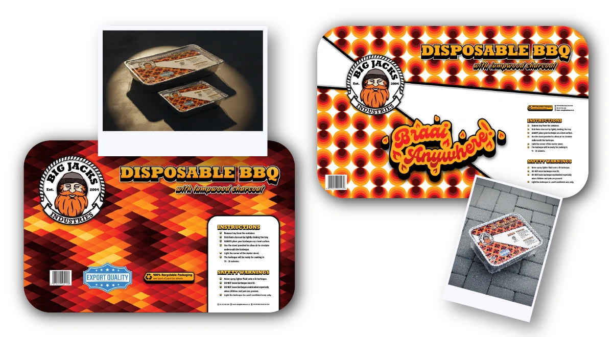
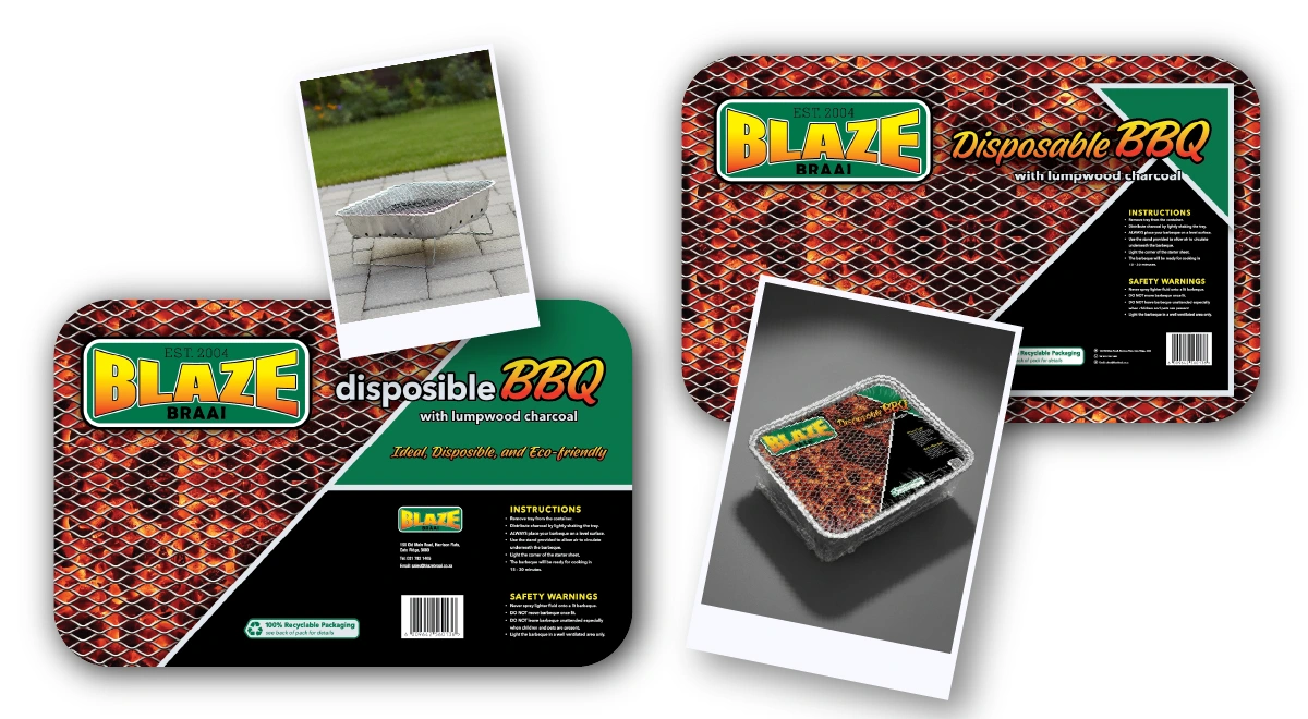
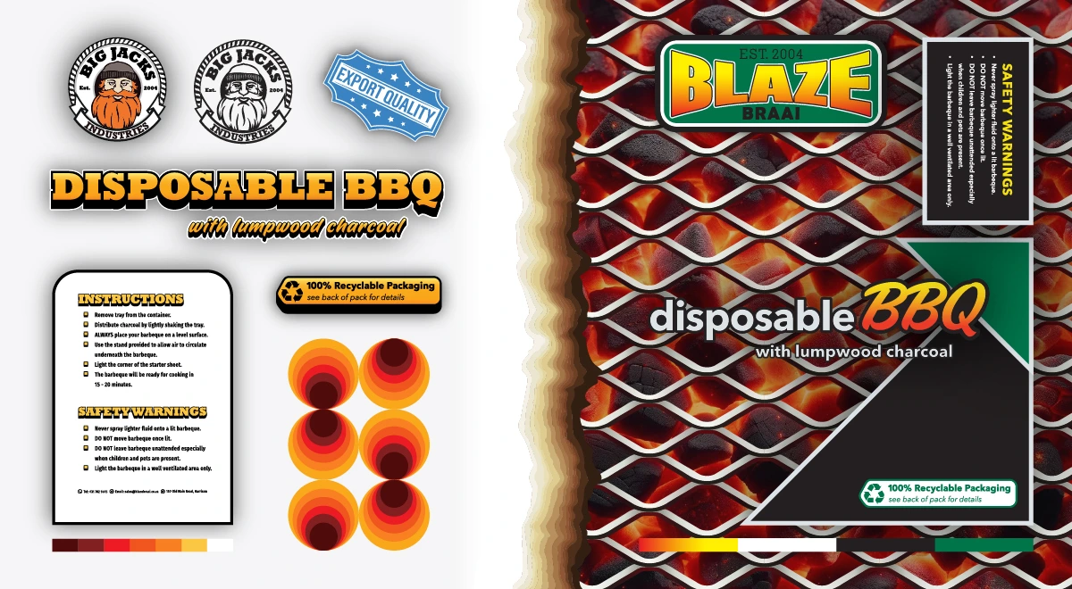
The project required the simultaneous launch of extensive new product lines—specifically firelighters and disposable barbeques—across two distinct tiers of the company’s portfolio: the established “Blaze®” parent brand and the “Big Jacks®” sub-brand. The primary strategic complexity lay in brand architecture: we needed to carve out a unique visual identity and market position for Big Jacks® to prevent it from cannibalizing the core Blaze® offering, while ensuring enough visual continuity to signal the shared quality and manufacturing lineage of the parent company. The packaging needed to perform a dual function: differentiating the products on a crowded retail shelf while creating a recognizably cohesive family of products.
The Solution
To address this, I moved beyond individual packaging layouts and developed a comprehensive modular design system. Following a rigorous process of creative briefing and iterative prototyping, I established a shared "visual vernacular" utilizing consistent layout grids, information hierarchy, and compliance component placement—to act as the unifying structural thread across both brands. On top of this shared framework, I engineered distinct visual layers for each identity. By manipulating color palettes, typography, and illustrative styles, I tailored the aesthetic to define a unique "voice" for Big Jacks® versus Blaze®. The final result was a scalable branding system where each product line possessed a unique identity capable of appealing to its specific target demographic, yet clearly belonged to a unified design family.